20 nature-themed color combinations for designers
Color combinations are not only a step in the design process but also an art of creating a distinctive impression. Harmonious color combinations help architects and designers appeal to customers' emotions while reinforcing their unique style and creating a distinctive brand.
Color combinations are not simply an arbitrary choice but also the key to defining a design style, whether it is classic, minimalist, modern, or sleek. To create a harmonious and impressive overall look, start by going back to the basics: color wheel theory. Let's explore the following article with LPC!
1. Discover 4 basic color combinations
1.1. Complementary color scheme
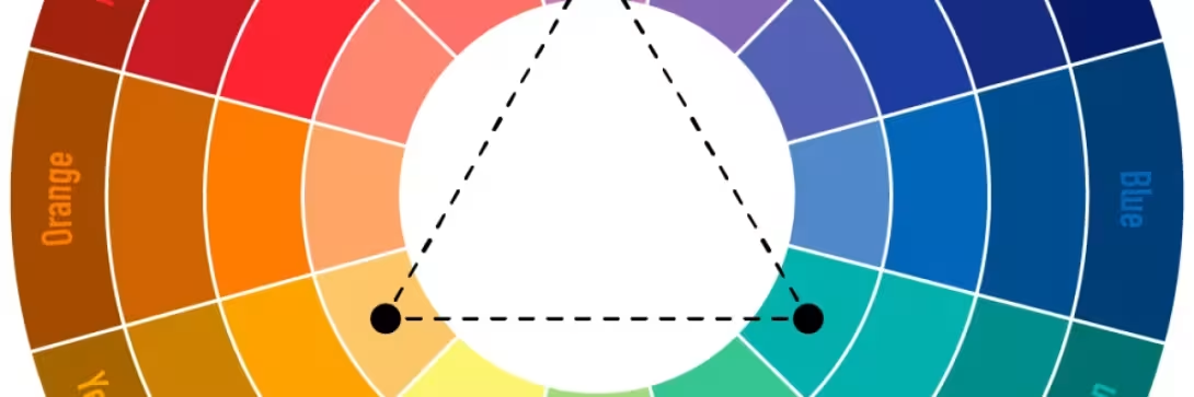
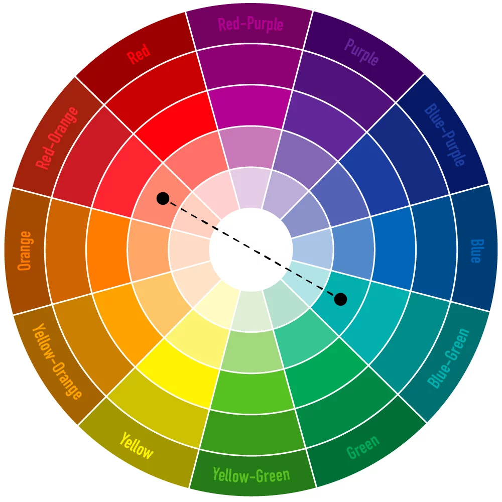
This technique combines two opposing colors on the color wheel, creating strong contrast and a sense of energy. Complementary colors make a design stand out, attract attention, and leave a strong impression.
1.2. Triadic color scheme
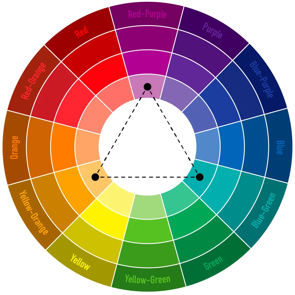
A triadic color scheme combines three colors that are evenly spaced on the color wheel, creating balance and harmony in a design. For example, the combination of red – yellow – green evokes a youthful and vibrant feeling, while blue – purple – orange creates a sense of elegance and sophistication.
1.3. Analogous color scheme
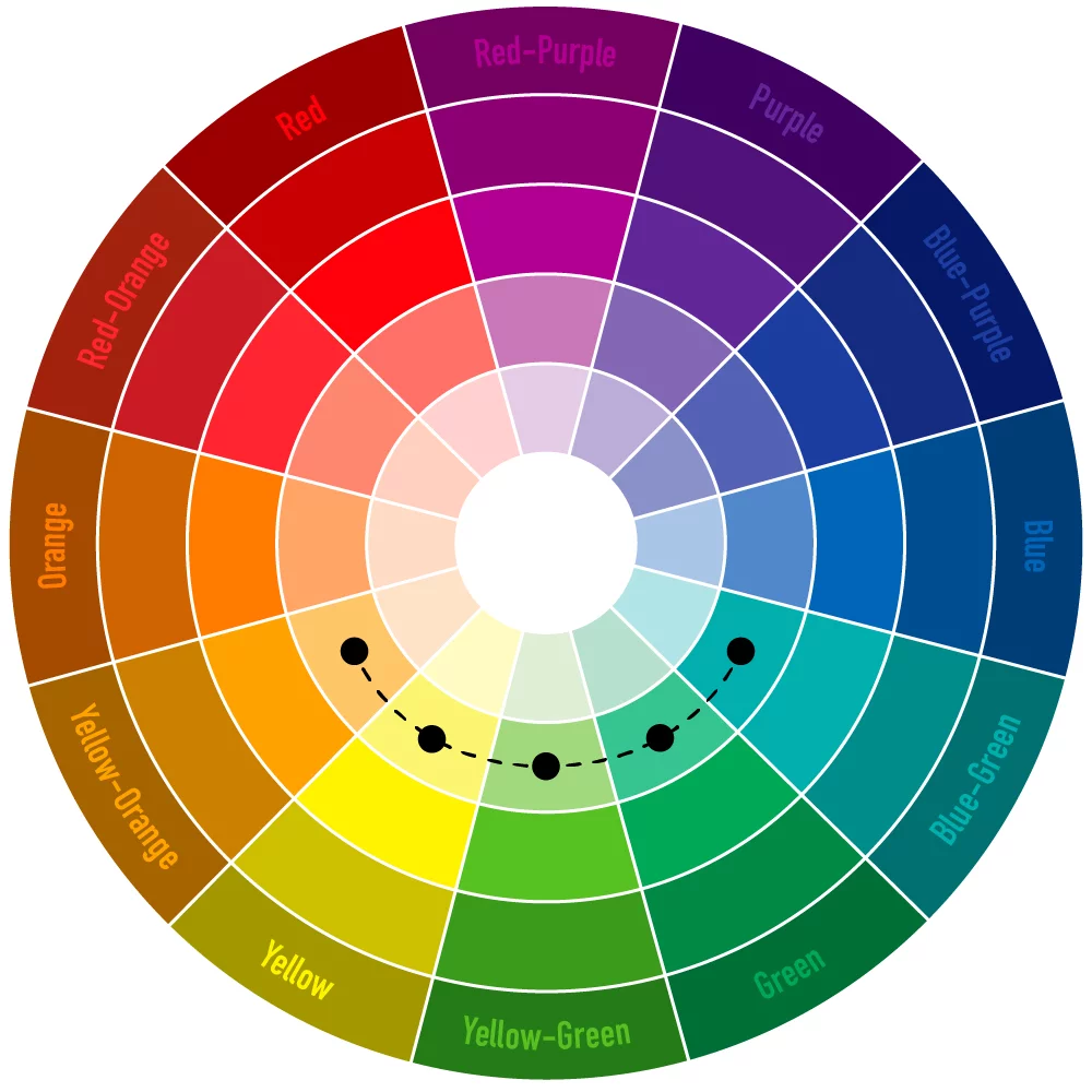
An analogous color scheme combines 2 to 5 colors that are adjacent to one another on the color wheel, creating smooth transitions and harmonious rhythm. This color scheme creates a gentle, natural feeling, making the design look sophisticated without being visually overwhelming.
1.4. Tetradic complementary color scheme
A tetradic color scheme combines four colors on the color wheel, forming two pairs of complementary colors, bringing richness and variety to a design. For example, the combination of red – yellow – green – blue creates a fresh and vibrant feeling, while orange – purple – blue – black evokes a sense of elegance and mystery.
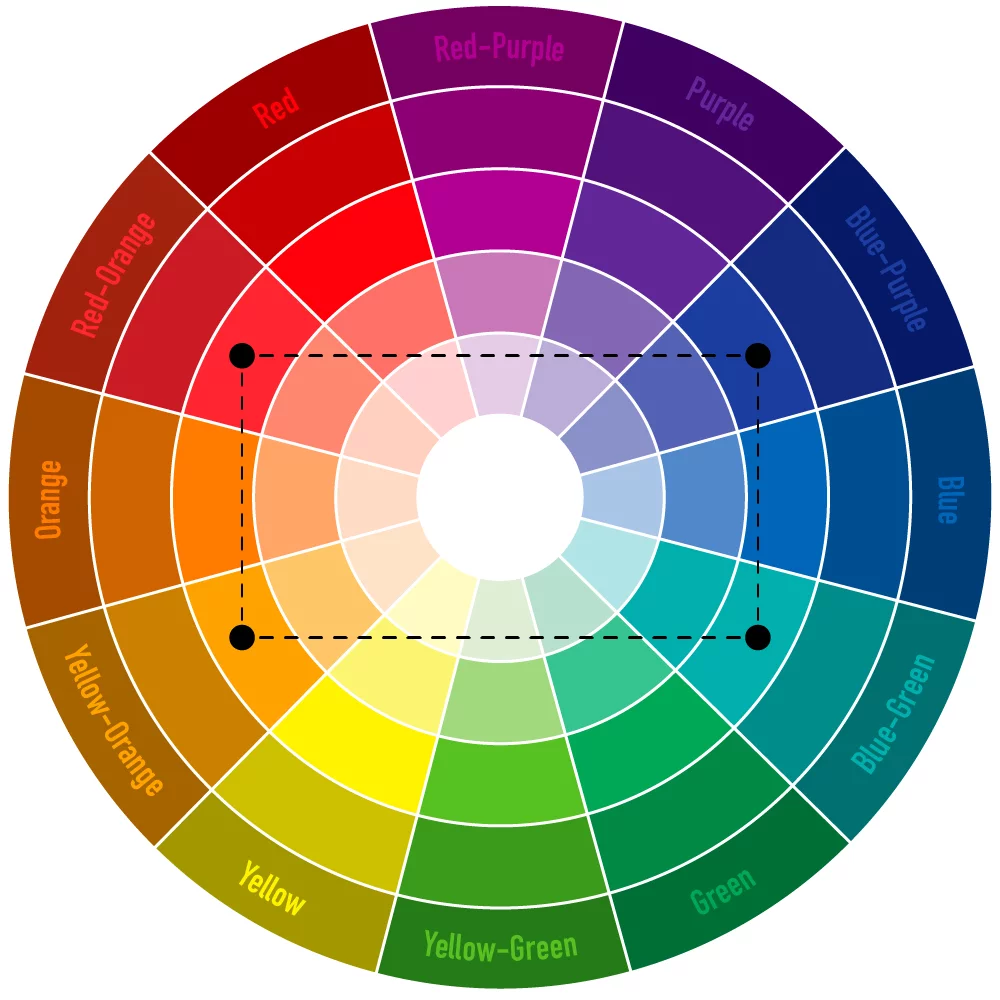
To make the design harmonious, colors should be distributed appropriately, with one dominant color selected while the remaining colors are used as accents to create an impressive visual focal point.
2. 20 nature-themed color combinations
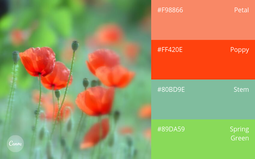
1. Spring Green
Spring always brings a brilliant new beginning, full of vitality. The combination of green with coral red-orange conveys fresh energy.
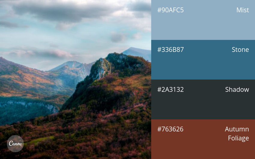
2. Bold and Overpowering
Red and blue are a classic contrasting color pair. The harmonious combination of these two colors creates a majestic and impressive appearance.
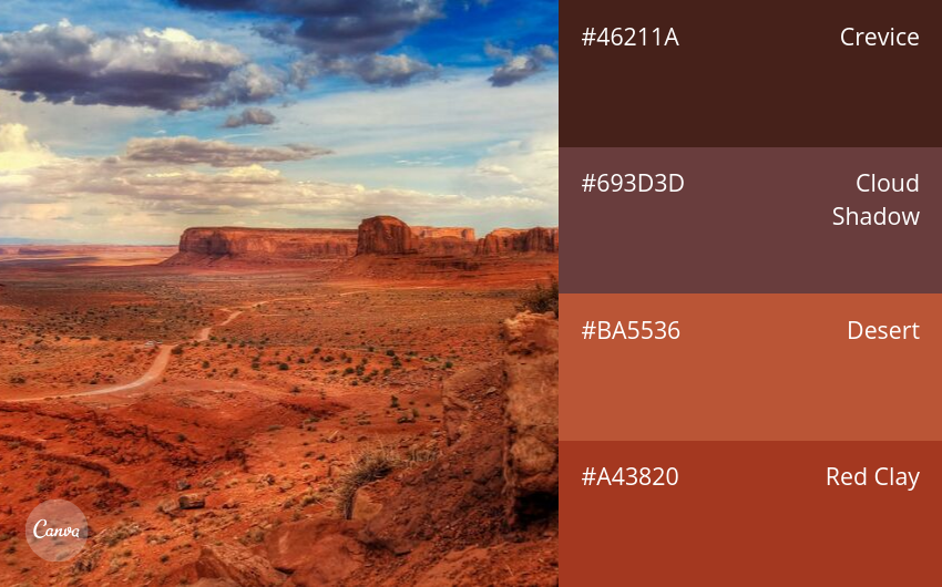
3. Desert Sand
Muted earth and sand tones blend together to create a rustic yet deeply layered beauty, evoking a sense of wilderness and mystery.
4. Striking and Dramatic
The natural beauty of Iceland resembles a mysterious painting. Dark gray creates a clear contrast with green, bringing a feeling that is both cool and fresh.
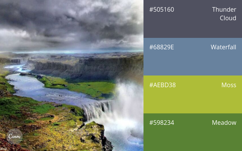
5. Plants and Nature
The combination of green and brown is a perfect symbol of nature. Brown creates a solid foundation that highlights the fresh green tones.
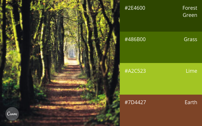
6. Blue Green
Blue Green is an ideal choice for balancing the freshness of green with the cool, peaceful feeling of blue.
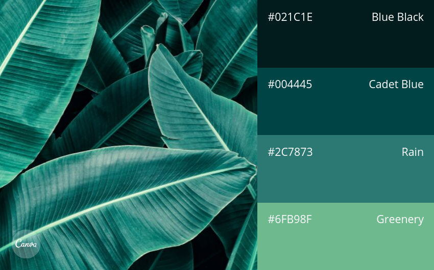
7. Cool Blue
Cool blue tones inspired by ocean waves, ranging from dark to light shades. An excellent choice for minimalist yet impressive designs.
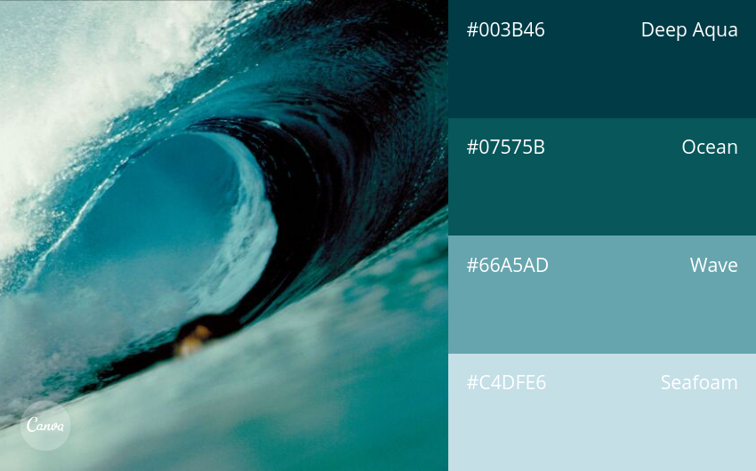
8. Gentle and Graceful
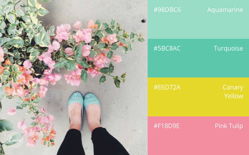
The combination of turquoise, canary yellow, and tulip pink creates a gentle and graceful palette, like a sweet melody.
9. Natural Green Tones
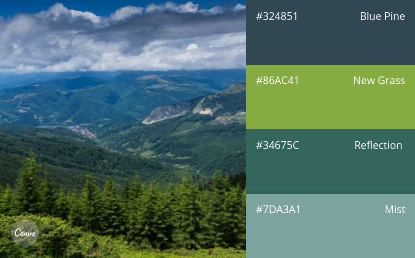
Shades of green from forests, plants, the sky, and bodies of water create a fresh, vibrant picture of nature.
10. Natural Energy
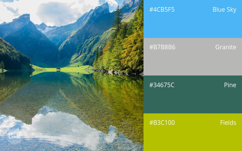
Bright shades of young rice green and blue blend into mountain and lake landscapes, creating a vibrant picture full of energy.
11. Autumn in Vermont
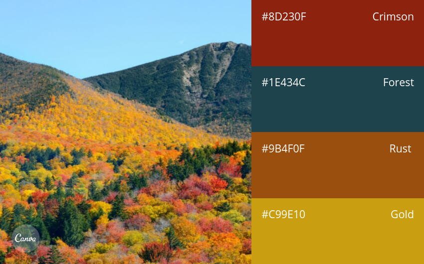
This color palette is inspired by warm autumn scenery, where flowers and leaves display their colors and bring out the captivating beauty of nature.
12. Spring and Fruit
Lemon yellow, berry pink, magenta, and lavender purple bring a fresh, vibrant feeling full of hope and vitality.
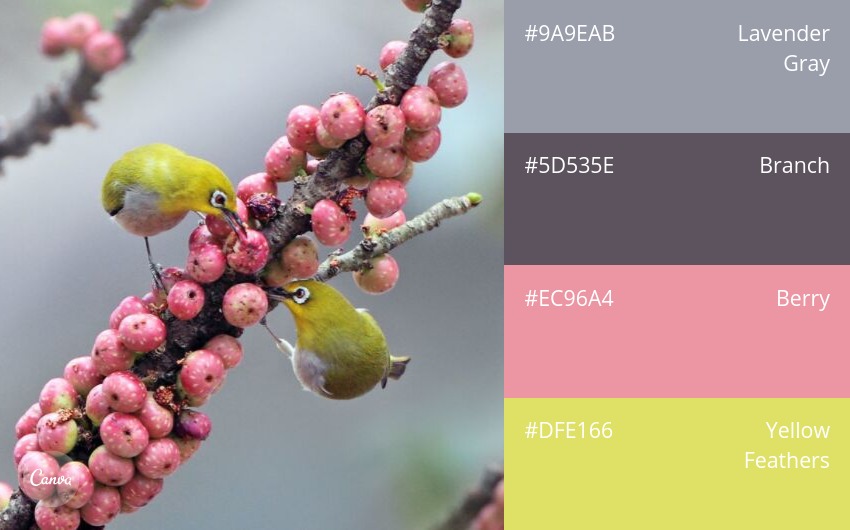
13. Day and Night
A wonderful example of sharp contrast. Strong, bright colors stand out against a fantastical and mysterious background.
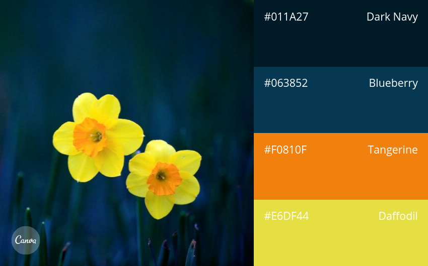
14. Insects and Flowers
The combination of insects and flowers creates a fresh, peaceful space, bringing a sense of relaxation.
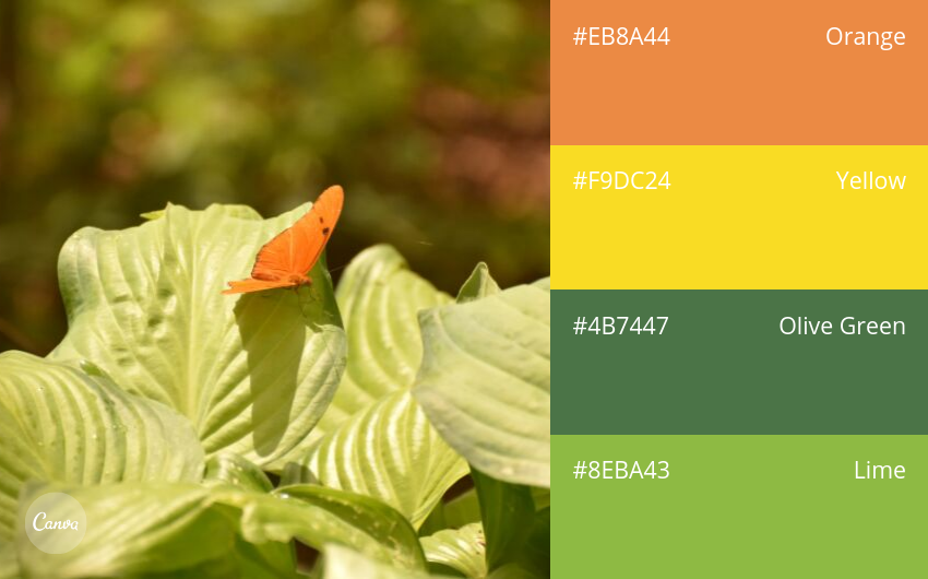
15. Late Sunset
The sky has not yet become completely dark, with shades of light earth brown, powder pink, blue, and deep purple delicately painted across the scene.
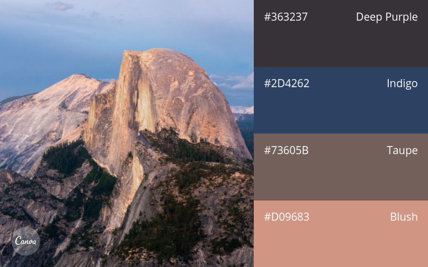
16. Tropical Flower Garden
A vibrant flower garden full of colors, where people can feel the warm breeze passing by, bringing a cheerful and youthful feeling.
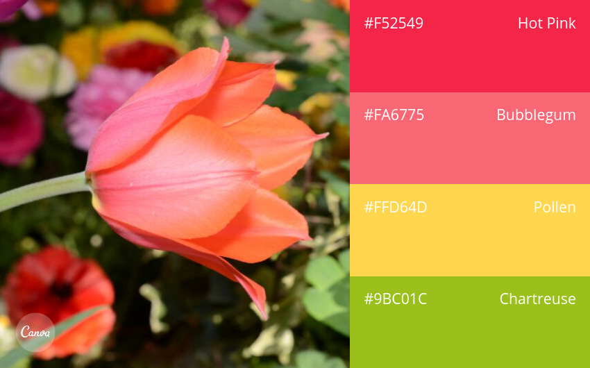
17. Warm Autumn
Tree branches and changing leaves create a warm feeling, as if announcing that autumn is approaching.
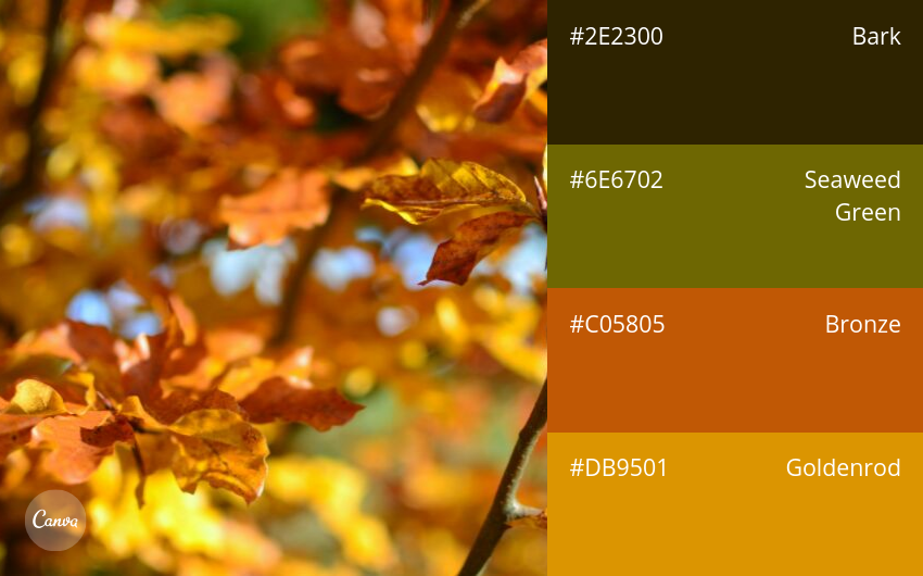
18. Retro Nature
Muted blue and yellow tones, once dominant trends of the previous century, are now being revived with style.
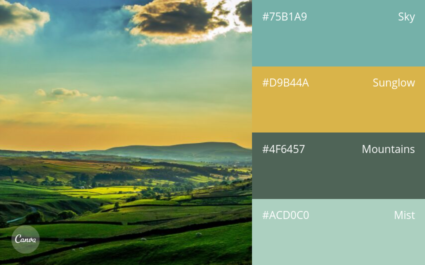
19. Modern and Sharp
The palette consists of dark blue, white, green, and lime green. This combination creates a fresh, clean, and vibrant feeling.
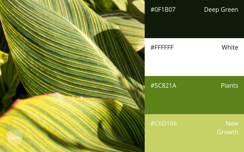
20. Timeless
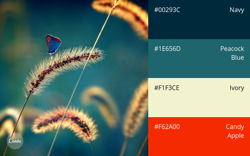
Neutral navy blue, orange-red, and blue green. This color combination appears in science-fiction designs, conveying strong inspiration.
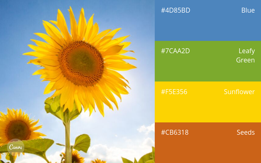
21. Summer Sunflower
The sunflower is a symbol of strong vitality, abundant energy, and a powerful spirit of striving forward.
The 20 basic nature-themed color combinations above will certainly give you more creative ideas for the architecture of your home in 2025.
Lam Pham Construction Co., Ltd. – LPC
- Hotline: 0911.29.9696
- Website: https://lpc.vn
- Facebook: Lam Pham Construction
Related articles
View all
Flexible, Continuously Adaptive Cities
According to observations of current phenomena and general assessments by experts, the 21st century will be a “war” between humans and various types of viruses. Their increasingly…
Building sustainable projects together
Follow expert knowledge from LPC engineers or contact us when you need advice.